What bold and vibrant color will dominate kitchens in 2023? KitchenAid has just unveiled their highly anticipated color predictions for the year ahead, and it’s sure to leave you excited and inspired. Get ready to discover the captivating hues that will transform your kitchen into a vibrant, energetic space.
Key Takeaways:
- KitchenAid has announced its 2023 Color of the Year, Hibiscus, a bold and vibrant fuchsia shade with a sleek matte finish.
- The selection process for the KitchenAid Color of the Year involves extensive research into global trends and sociocultural influences.
- Previous Color of the Year releases, such as Beetroot, Honey, Kyoto Glow, and Bird of Paradise, have all brought unique stories and emotions into the kitchen.
- KitchenAid colors have the power to evoke specific moods and reflect individual personality and style.
- Stay tuned for more exciting color releases from KitchenAid in the future.
KitchenAid Color of the Year Selection Process
The selection of the KitchenAid Color of the Year is a meticulous and thoughtful process. At KitchenAid, we take pride in our commitment to choosing colors that resonate with our customers and meet their emotional needs. Our global design team begins their research around 18 months before the color launch, identifying trends and exploring sociocultural influences from all regions of the world. We believe that color is more than just a visual attribute; it has the power to evoke certain emotions and create a desired mood in the kitchen.
During the research phase, our team dives deep into various industries such as fashion, design, food, and more, to gather inspiration and insights. We analyze these trends and influences to understand the current emotional needs of our customers. We then present 2 or 3 topics and color choices to ensure a well-rounded selection.
Emphasizing the emotional power of color, our design team aims to choose colors that fulfill the current emotional needs of our customers.
When making the final decision, we carefully balance the new color options against our existing KitchenAid color portfolio. We consider the range of colors and ensure that the new addition complements our existing offerings. This process ensures that our customers have a diverse and vibrant palette to choose from, allowing them to truly express their personality and style in the kitchen.
Through our comprehensive color trends research, we strive to pioneer kitchen color trends and offer innovative choices that enhance the culinary experience. The selection of our Color of the Year reflects the collective efforts of our design team, who are dedicated to staying ahead of the curve and providing our customers with exciting and inspiring options.
KitchenAid Color of the Year Selection Process Steps
| Step | Description |
|---|---|
| 1 | Identify trends and explore sociocultural influences from all regions of the world |
| 2 | Analyze fashion, design, food, and other industry trends for inspiration |
| 3 | Present 2 or 3 topics and color choices |
| 4 | Balance new color options against existing KitchenAid color portfolio |
| 5 | Choose color that fulfills current emotional needs of customers |
By following this intricate color selection process, we ensure that our Color of the Year resonates with our customers and brings excitement and inspiration to their kitchen spaces.
Past Color of the Year Releases
Over the years, KitchenAid has introduced a range of captivating colors as their Color of the Year. Each color selection tells a unique story and taps into the emotional needs of the world. Let’s take a look at some of the past Color of the Year releases:
- 2022: Beetroot
- 2021: Honey
- 2020: Kyoto Glow
- 2019: Bird of Paradise
A vibrant and energetic shade of purple, Beetroot represented the desire to reemerge into the world. This bold color choice reflected the resilience and optimism of individuals seeking a fresh start.
Celebrating connections and empathy, Honey was a warm and comforting golden-orange hue. This color represented the importance of fostering strong relationships and finding the sweetness in every moment.
Inspired by the quest for balance and wellness, Kyoto Glow was a vibrant green shade reminiscent of lush forests. This color choice aimed to bring a sense of harmony and tranquility to the kitchen space.
Evoke the desire for exotic adventures, Bird of Paradise was a vibrant coral shade. This color symbolized a love for exploration and embracing new experiences, adding a touch of excitement to the kitchen.
Each Color of the Year release from KitchenAid has brought a unique perspective and vibrancy to kitchen spaces. These colors go beyond being mere design choices and instead tap into the emotional needs and aspirations of individuals.
The Impact of KitchenAid Colors in the Kitchen
KitchenAid believes that color is not just a visual attribute but also a powerful tool that can create specific moods and emotions in the kitchen. The brand’s extensive range of colors allows individuals to choose the hue that best represents their personality and style.
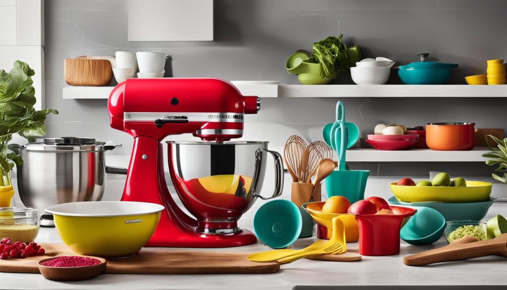
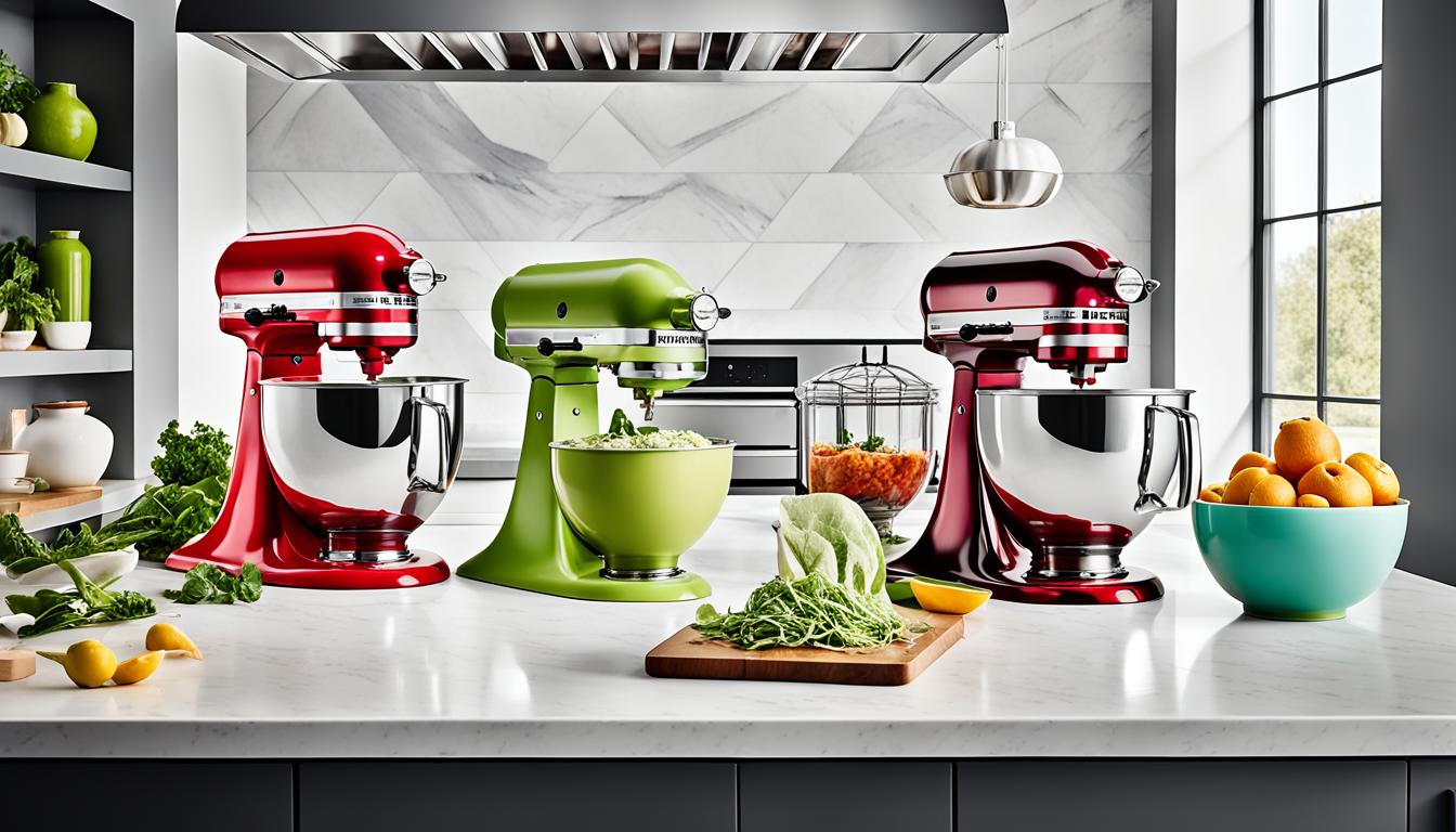
A KitchenAid stand mixer, for example, can be seen as a statement piece in the kitchen, showcasing the user’s personality and inspiring creativity. Colors like Hibiscus can add a pop of excitement to a neutral kitchen or be paired with other colors for a maximalist look.
“Colors, like features, follow the changes of the emotions.” – Pablo Picasso
The goal is to create a kitchen environment that sparks joy and encourages culinary adventures. A vibrant color, such as Hibiscus, can uplift the mood and energize the space, making cooking and baking a delightful experience.
Studies have shown that colors can also impact appetite and food perception. Warm colors like red and orange are believed to stimulate appetite, while cooler colors like blue can have a calming effect. By choosing the right KitchenAid color, you can enhance the overall dining experience for you and your guests.
Whether you’re a bold trendsetter or someone who prefers a more subdued aesthetic, KitchenAid offers a color palette that caters to every preference. From classic neutrals to vibrant jewel tones, there’s a KitchenAid color that’s perfect for your kitchen.
So go ahead, unleash your creativity, and let the colors of KitchenAid transform your kitchen into a space that reflects your individuality and inspires culinary exploration.

Conclusion
KitchenAid’s unveiling of the vibrant fuchsia shade, Hibiscus, as the Color of the Year for 2023 highlights the brand’s ongoing commitment to creativity, emotional storytelling, and deep connection with consumers. Through their meticulous selection process and detailed consideration of sociocultural trends, KitchenAid ensures that their chosen color resonates with individuals and fulfills their emotional needs.
The power of KitchenAid’s colors goes beyond aesthetics, as they have the ability to transform kitchens into spaces that reflect personal style, inspire culinary exploration, and ignite a sense of joy. The evocative nature of color allows individuals to infuse their kitchens with their own unique personality, making a statement with appliances like the renowned KitchenAid stand mixer.
As we look ahead, we anticipate more exciting color releases and trends from KitchenAid in the future. With their strong track record of capturing the pulse of current emotions and aspirations, they are poised to continue setting the tone in kitchen design and inspiring individuals to create beautiful and meaningful culinary experiences.
